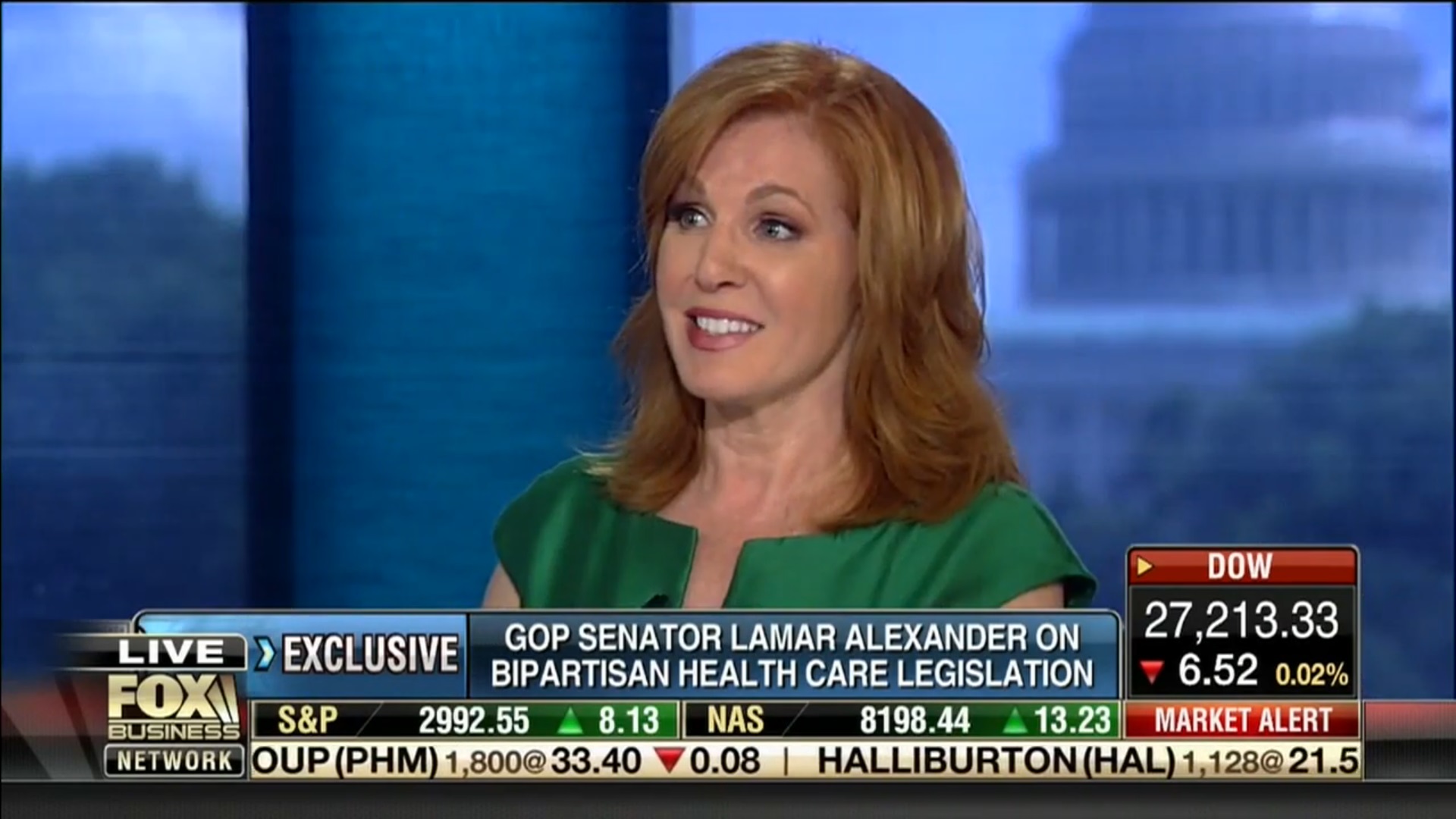
With the foxbusiness.com website and app undergoing a revamp (you have to pay to see their live TV), along with their new slogan "Investing In You" being touted by everyone from Maria Bartiromo, Stuart Varney, Neil Cavuto, Charles Payne, and of course the always intelligent and fabulous Liz Claman

--what did viewers get to see?
All we got from their revised (not exactly new) ticker on September 30 (which is eerily similar to what is seen on Fox News with the blue lettering against a mostly pure white background) is
absolute junk 
.
Let me mention a handful of some other reasons why this set of graphics are simply too ugly to look at for 30 seconds, let alone 2 or 3 minutes at a time

:
1. The logo--used to be gold on a black background, now it is a navy blue similar to what sailors wear against a pure white background. Just watching the graphics for 30 seconds, let alone 2 or 3 minutes is simply horrible to view.
2. The ticker is much smaller to read, albeit the movement across the screen is a bit on the quicker side.
3. When the Dow, oil prices, whatever is the hotter index--we used to see it in bolder typeface down in the lower right corner.
What we get instead is very thin numbers, and what is worse--it is also seen in the opening seconds (still with the green is the index was up, red if it was down) on Melissa Francis and Connell McShane's show
After The Bell.

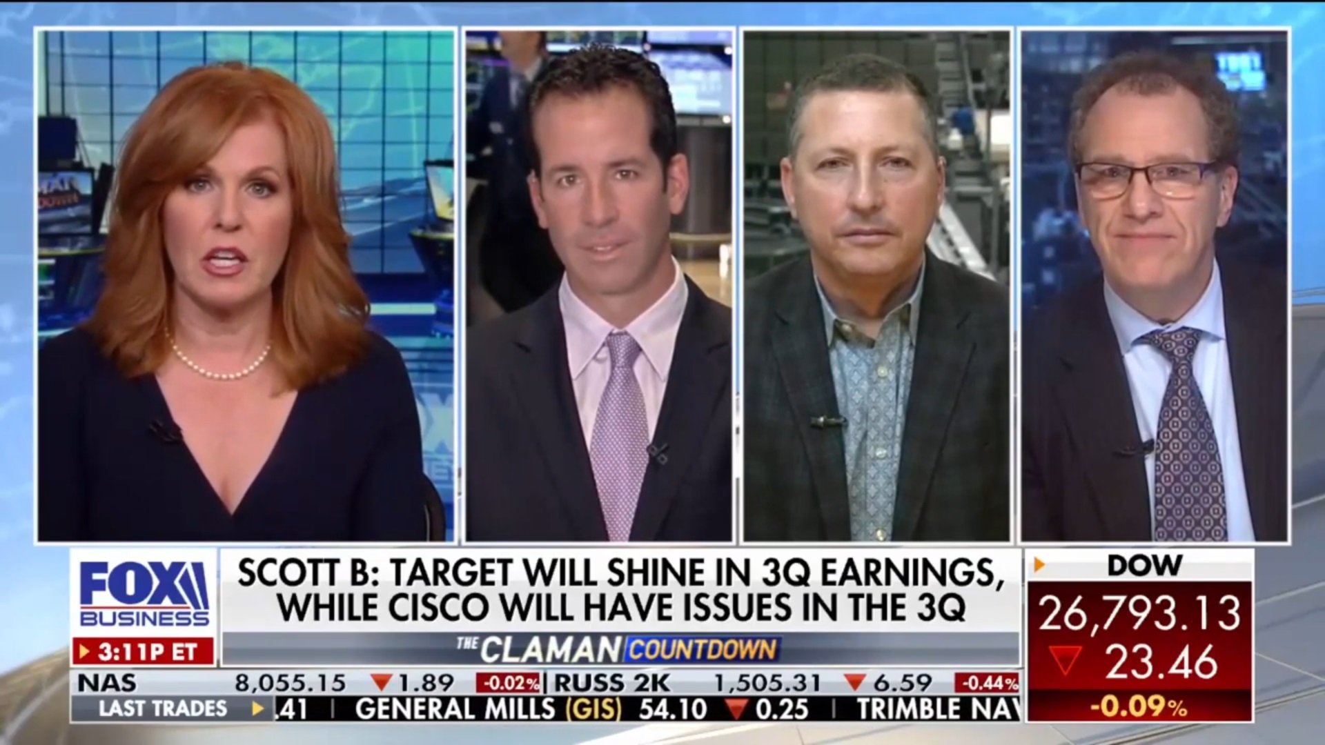
Although the graphics during portions of
The Claman Countdown remain intact, I don't know why everything else had to be with a freaking white background

?!
As a diehard watcher of the show since day one on October 15, 2007--I went to the foxbusiness.com website and scrolled down to their FAQ's to see if there was an email I could vent my frustration and maybe get a concrete answer to my questions.
What I saw instead were questions that mostly deal with any technical problems on the site itself--not one question dealing with the graphics used on the shows.

I do not understand at all why FBN did this.
So, my only logical question is this...
Can anyone actually email or call Fox Business and say why their on air graphics are extremely difficult to read?
In the immortal words of the 1930's Popeye cartoons, it basically said:
Leave Well Enough Alone.


 :
:
 .
.